Carriage Hill Project Reveal
Do you love a good before and after? Well hold onto your caps (or is it hats? err butts? not sure of the idiom but you get the idea). Today we're revealing the Carriage Hill Project! The homeowners are a lovely newlywed couple who reached out to us in August to renovate their first home. The house, in it's original state, was oozing with potential and had so many great features; nice layout, beautiful moldings, heated floors, gorgeous backyard etc (good bones as they say in the biz). We were tasked to update the whole house and give it a more contemporary feel. We are super pleased with the way this one turned out and we can't wait to share the results with you so without further adieu here is the Carriage Hill Project Reveal.
Let's start in the kitchen. The original kitchen was updated 5 or 6 years ago and while it had some nice off-white cabinetry the rest of the kitchen came across yellow and outdated. There was also a bizarre pendant light that went through the bulkhead over the sink. We decided to remove this bulk head, add some floating shelves and a new artisan tile backsplash in a herringbone pattern. We updated the appliances, lighting and installed a new Blanco Quatrus Drop-in sink with matching Blanco Urbena Stainless Steel faucet. Updating the sink was super easy and made a big impact on the overall renovation. Blanco products are designed with innovation and quality so we know they're built to last. Finally, we updated the cabinet hardware with some gorgeous high quality black knobs and pulls from the Schaub & Company. We selected these black pulls from their Northport Collection because the base of these pulls were large enough to cover the holes from the previous hardware (which had an odd size).
The Before:
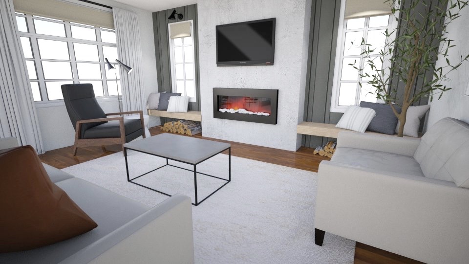
The Rendering:
The After:
Next, let's take a look at the living room, this was another huge change. The original living room was mismatched and frumpy (I should preface this by noting the furniture in the before photo is not my client's). The space was long and narrow so depth in the space was at premium. The contractor, Newman Innovations, built us this amazing stucco grey contemporary fireplace flanked by vertical shiplap painted in Dolphin by Benjamin Moore. They built two reclaimed wood benches on either side of the fireplace for additional seating and storage underneath. Wall benches are a great solution to increase seating without compromising depth since benches don't require any space behind them like an accent chair. We layered in some textures and patterns to create a cozy feel.
The Before:
The best part of this living room renovation was the half wall we created between the kitchen and the living room. Since we were unable to remove the wall completely we decided to open things up with a beautifully crafted half wall. I love how it looks like a piece a furniture blended into the space like it has always been there.
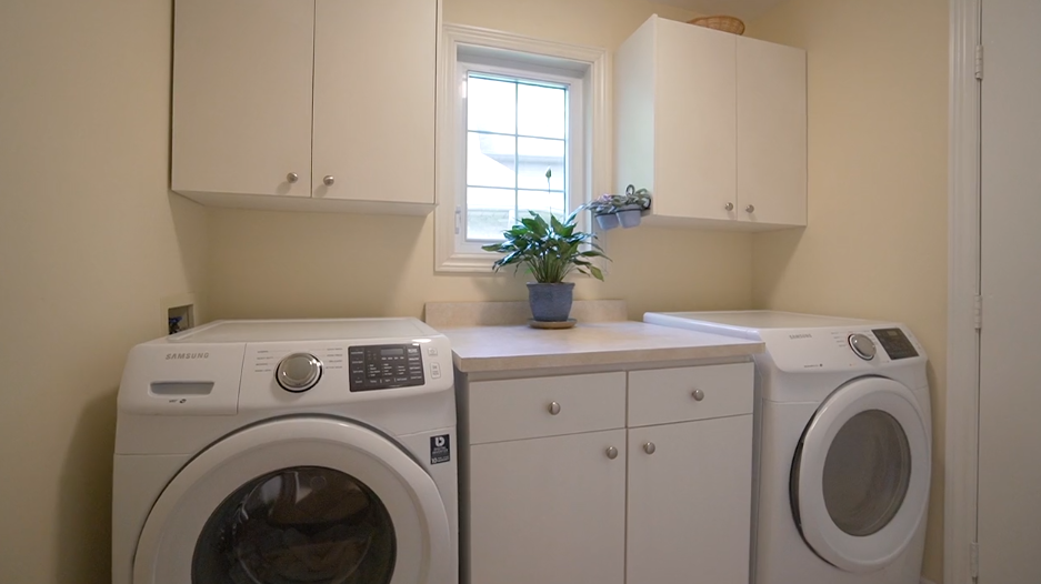
We also updated the Laundry Room, it's not a huge change but enough to make it feel fresh and new. In this space we updated the cabinetry, added a backsplash, countertop and added a Blanco sink. This time we went with the Blanco Farmhouse IKON Sink in Concrete gray. The IKON sink is the world’s first apron front sink made of SILGRANIT, a natural granite composite. It will not scratch or stain, it is extremely hard-wearing and exceptionally easy to clean which is perfect for a laundry room. We went with the colour concrete gray to reflect the grey stucco finish of the fireplace in the other room.
The Before:
The Rendering:
The After:
We also updated the main floor powder room with a new navy blue vanity, gold faucet and some fun wallpaper from Spoonflower. Spoonflower is a print on-demand online marketplace full of wallpaper and fabric designs by independent artists. With more than 1 million designs available, there's something for everyone. The specific design we used in this space is called Fields of Joy by Scarlett Soliel.
The Before:
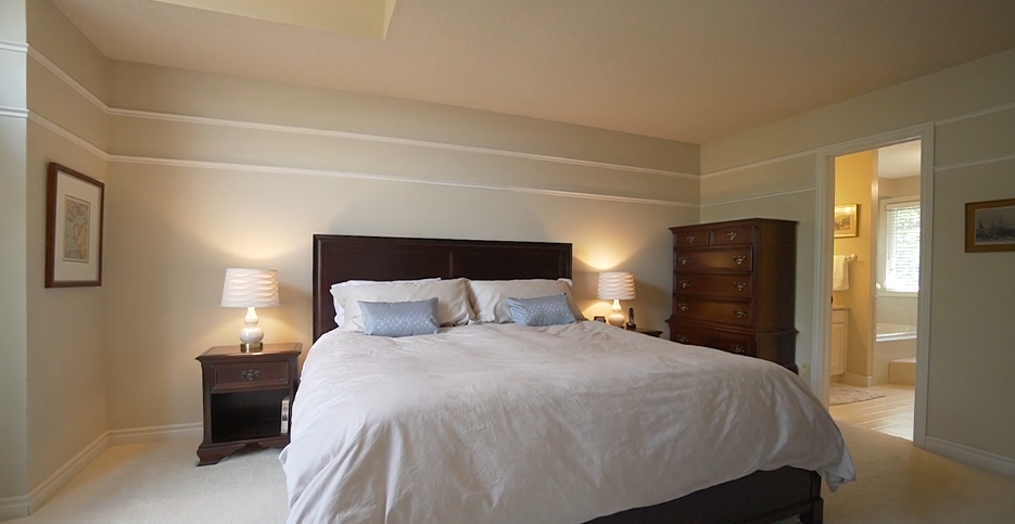
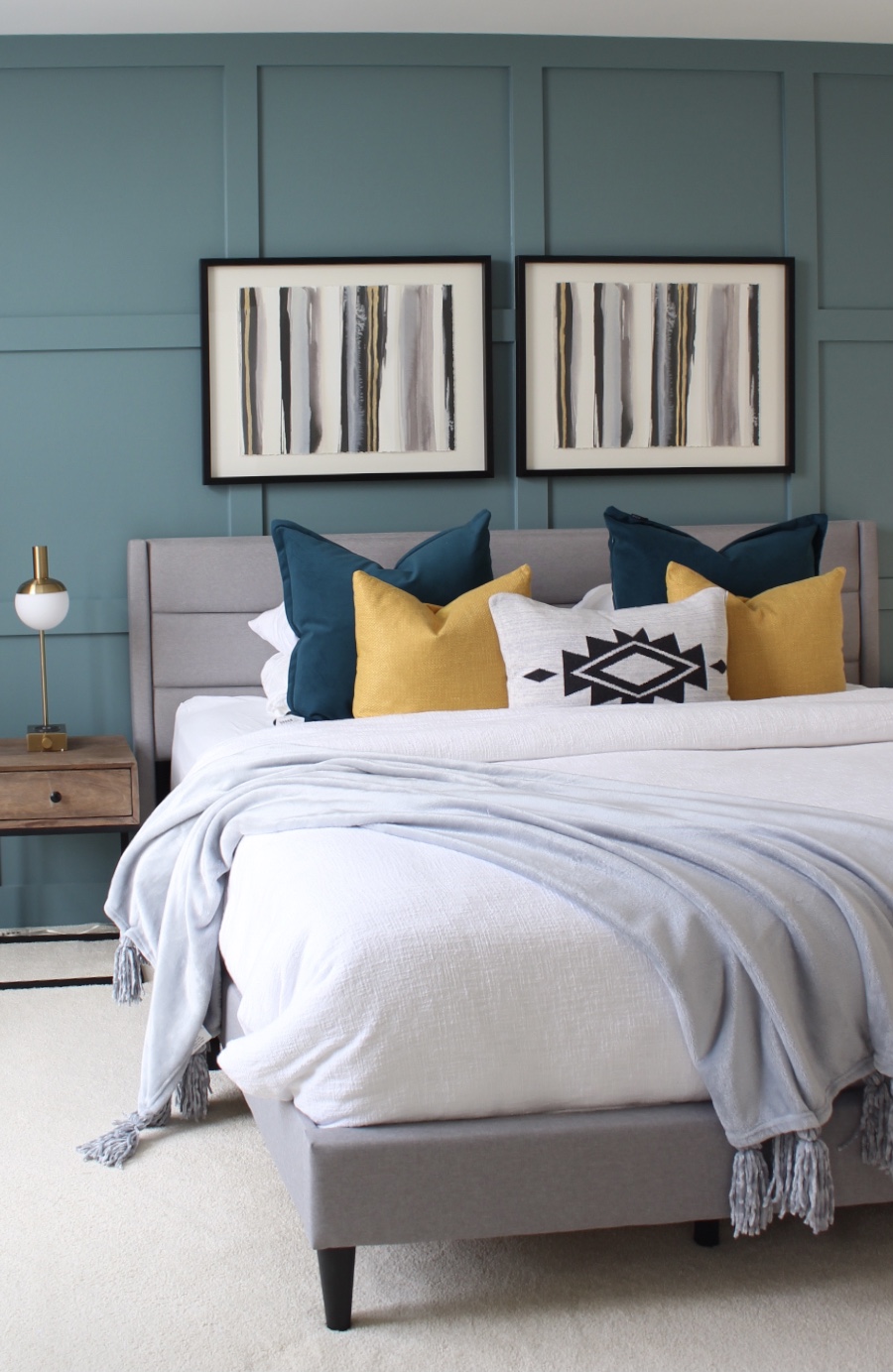
Next up is the master suite. The ask here was colour, colour and more colour. We created this beautiful board and batten wall painted in Blue Danube by Benjamin Moore. We added some mustard yellow accents against the grey upholstered bed to really make the space pop.
The Before:
The After:
Let's not forget the master bathroom. This space feels like a boutique hotel.
I hope you enjoyed this reveal as much as we did. The homeowners now have their home back and just in time for the holidays. We hope it is the perfect backdrop to the many memories they are sure to make in this beautiful home. Special thanks to our sponsors Blanco Canada, Schaub & Co hardware and Spoonflower.


0 comments