One Room Challenge Reveal - Fall 2018 - Mid Century Modern Farmhouse Kitchen
We made it! It’s the final reveal of the One Room Challenge (ORC) Fall 2018 sponsored by Better Homes & Gardens! Today I’m unveiling my mid century modern farmhouse kitchen makeover! I’m so happy with the way it turned out. It’s a true mix of mid-century and modern farmhouse. It has all the elements of mid-century (in keeping with the history of our house) but with enough modern elements to keep it relevant for today. Let me know what you think in the comments below!
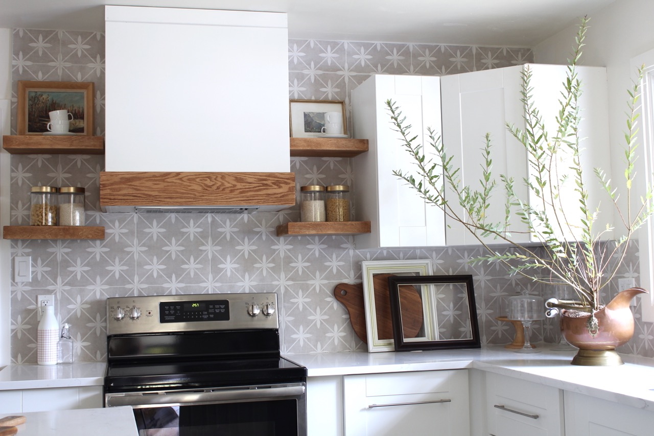
If you're new here, let me give you some background, we bought this cute mid century bungalow as a small flip project and have made so many changes to it that we are beginning to fall in love. When we first opened the door it was a like a time capsule from the 1960's. You can get a better idea of what I'm talking about in the Week 1 before photos. Our aim is to sell this puppy back to a first time home buyer at a reasonable price so we've tried to keep our costs as low as a possible during this kitchen makeover. You will see our appliances are not top of the line but they fit our budget and still look good. We tried to DIY wherever possible like with the range hood, yes, that's a DIY range hood for under $250 (read more about it in Week 3). Oh yes and you can catch up on any of the previous weeks below:
Here is a quick pic of what the kitchen looked like a few weeks ago:
In the beginning we had planned to knock down the wall between the kitchen and dining room but for numerous reasons we weren't able to so we instead decided to expand the door way. This was a good solution because it does feel more open concept but there's enough wall to hide the dishes in the kitchen haha.
For our sink we selected the Blanco VISION 210 double SILGRANIT sink because of it's durability and looks. SILGRANIT is a natural granite composite material that is strong, durable and comes in seven colours. This sink is part of the VISION series that has a variety of bowl configurations, options and accessories plus it's made in Canada so that's a plus for me.
We also installed the Blanco SOLENTA Senso faucet. This faucet has touchless technology allowing you to activate the on and off switch without touching the handle. It's a really unique and practical feature (especially when you're cooking with poultry).
Our cabinet hardware is from Schaub and Company, they have a ton of selection of really unique yet timeless hardware. We selected Regatta pulls in a Satin Nickel finish. I love how delicate yet substantial they are and I love how they create a perfect horizontal line across each door. We hung them all horizontal (even on the uppers) to give it a modern and clean feel.
If you've been following me on Instagram
you know I was searching for some affordable copper pots because I really want the kitchen to have a mix of metals. I never found them so I couldn't make my pot rack as I had hoped but my
mother-in-law lent me an amazing antique copper urn and I think it adds the perfect amount of copper.
Our Laura Ashley ceramic tile backsplash in Wicker Dove Grey. We picked up this tile from Eden Tile-it and I love it. It adds a bit of interest without being over bearing. In an ideal world I would have done open shelves all the way across but I wanted to give the next home-owners some uppers with privacy (these are the only ones in the room).
These incredible counter stools are from Hayneedle. They are metal which is great for my two little kids because they can make a mess and I can wipe it right off. Plus they are super stylish and add another modern touch to the space while anchoring the island. They really balance the black framed window and dining chairs. The mirror is a thrift store find but I found another bamboo style mirror for you.
The wallpaper in the dining room is from Spoonflower, the largest indie design marketplace in the world, where you can create your own design or choose from over 650,000 designs online. I selected Parrots, Tulips & Ferns by Andrea Alice (I might be partial to the name). I love the subtle design and I love the hint of throw-back to the mid-century era.
The chairs and ottoman in the dining room are from Article a Canadian company full of mid century inspired furniture. I am in love with this store. I love the skinny legs of the chairs and how comfortable they are. They really add a juxtaposition to the antique duncan phyfe table.
Special thanks to my sponsors; Schaub and Company, Article, Hayneedle, Hudson Valley Lighting and Blanco Canada. I'd also like to thank Better Homes & Gardens for being the media partner for this event.
Media Partner Better Homes & Gardens | TM by ORC


14 comments
Wow! What a transformation! Impressive!
ReplyDeleteThanks Jordana!
DeleteThis is lovely!! The tile is pretty and adds a lot of interest without being overwhelming. I really like the horizontal hardware on the doors! I also love how you paired the mid-mod chairs with the antique table. I love old pieces, but sometimes they make the room feel too heavy or old- you definitely solved that problem.
ReplyDeleteEverything looks so fresh and beautiful- thanks for sharing all your hard work with us!!!
Love the new spaces!!! Great mix of different decor styles. Congrats on a fab ORC! ~~ Susie from The Chelsea Project
ReplyDeletewhat an amazing transformation!!!! Well done!!!
ReplyDeletemegan from megan bachmann interiors
www.meganbachmann.com
That tile! Such a great choice.
ReplyDeleteCongrats!
xo,
Kelly
www.kellygolightly.com
The tile and wallpaper play so nicely together! This is a great example of decorating with neutral colors without getting boring. Congrats on getting it done!!!
ReplyDeleteIt looks wonderful, awesome job!
ReplyDeleteYou did such an amazing job!!! Congratulations!! I really love the tile you chose!! Everything is on point!
ReplyDeleteAh this turned out so good! So simple and beautiful!! Awesome job!
ReplyDeleteYour new kitchen is stunning! I love the wood floating shelves and the ottoman at the end of the dining table. :) Well done!!
ReplyDeleteSo bright and elegant. Are you sure you're not going to miss that scalloped valance above the sink window? 😆
ReplyDeleteI love it! It looks like the perfect blend of high-end living with an affordable price tag. You handled this past six weeks like a champ. You never needed my hand holding or my cheerleading. :D Enjoy all your hard work! It was well worth it.
ReplyDeleteGreat job! So many budget-friendly ideas for everyone. Love that hood!
ReplyDelete